Mindbreeze Typography
Intro
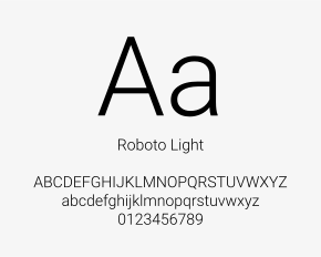
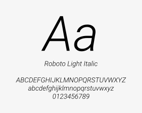
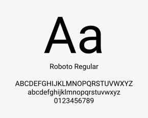
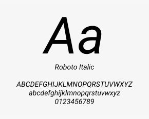
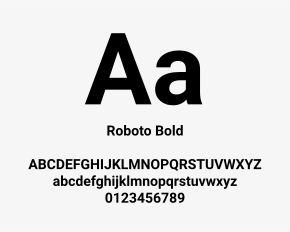
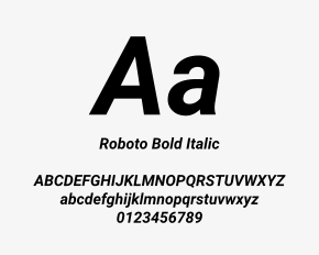
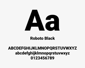
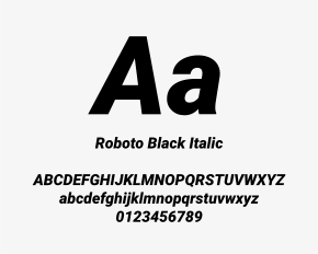
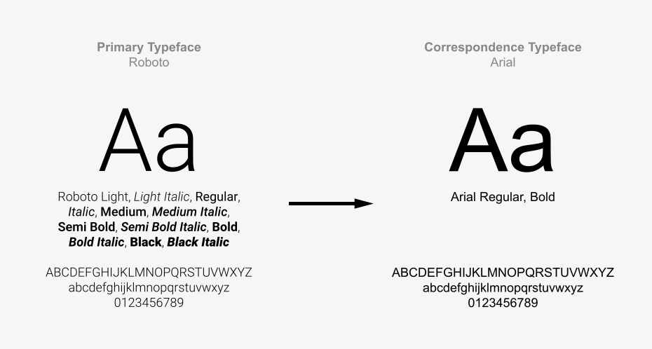
The primary Mindbreeze typeface is the Google Font Roboto. Its broad range of weights allows for clear hierarchy while maintaining a clean and consistent visual appearance across digital, print, presentation, and office applications.
Primary Typeface
The Google Font Roboto is the primary typeface of the Mindbreeze brand. It should be used for all brand communication whenever possible. The font is installed by default on all Mindbreeze PCs. If the font is needed for other purposes, please contact the Mindbreeze Product Marketing Team.
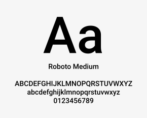
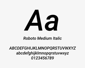
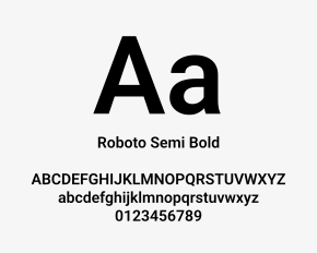
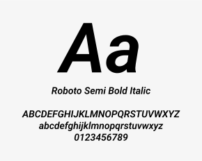
Fonts & Compatibility
For Microsoft PowerPoint presentations, the Google Font Roboto must be embedded in the file to ensure correct display. This is especially important when presentations are shared with recipients who may not have the font installed locally.
To embed the font in PowerPoint, select the “Embed fonts in the file” option in the Save settings.

Correspondence
The Google Font Roboto is generally used for Mindbreeze brand communication. In environments where Roboto cannot be guaranteed, such as emails, Word documents, or other Office applications, Arial should be used as the fallback typeface.
Arial is available by default on common operating systems and ensures reliable display for all recipients.
Emphasis
Use font weight, size, or color contrast to emphasize important content.
Preferred forms of emphasis:
- Bold or Semi Bold font weight
- Size contrast
- Mindbreeze Yellow for selective highlights or calls to action
- Grayscale contrast for supporting information
- Avoid underlining, excessive capitalization, expanded character spacing, or too many emphasis styles in one layout.
Text Colors
Text colors should provide strong contrast and support readability.
- Use black or dark grayscale values for body text on light backgrounds.
- Use white text on black or dark backgrounds.
- Use Mindbreeze Yellow selectively for highlights, calls to action, or brand accents.
- Do not use yellow for long text passages.
- Do not place yellow text on white or light gray backgrounds when contrast is weak.
- Do not use low-contrast grayscale combinations for important information.