Mindbreeze Logo
Intro
The Mindbreeze logo is a central element of our brand identity. It creates recognition, strengthens consistency, and ensures a clear Mindbreeze presence across all digital, print, presentation, spatial, and branded applications.
The logo may only be used in the approved versions provided in the Brandbase. Spacing, proportions, colors, and composition are precisely defined and may not be modified.
Logo Versions
Several logo versions are available to support different formats, backgrounds, and applications. The primary logo is the preferred version and should be used whenever the layout allows.
Alternative logo versions are available for compact formats, limited space, standalone brand marks, and special visual applications.
Primary Logo
The primary logo is the standard Mindbreeze logo and should be used for most communication materials. It provides the strongest brand recognition and is the first choice for digital, print, presentation, and marketing applications.



Alternative Square Logo
The square logo is used when the available space does not support the full primary logo. It is suitable for compact layouts, social media applications, icons, thumbnails, and other formats with limited horizontal space.

Alternative Compact Logo
The compact logo provides a reduced horizontal format while maintaining a clear Mindbreeze presence. It should be used when the primary logo is too wide for the selected layout.
Roundel Logo
The roundel can be used as a standalone brand mark in selected applications. It is suitable for compact placements, branded details, merchandise, digital icons, and applications where a simplified Mindbreeze identifier is required.




Logo Guidelines & Usage
Consistent logo usage is essential to maintaining a strong and recognizable Mindbreeze brand. Always use the approved logo files provided in this Brandbase and follow the guidelines below to ensure clarity, consistency, and visual impact across all applications.
Logo Specifications
Size
The logo must always be displayed at a size that ensures clear legibility and appropriate visual presence. It should be large enough for the wordmark, symbol, and all details to remain clearly recognizable, while not dominating the layout or distracting from the main message. The logo size should be adapted to the specific application and format, maintaining a balanced relationship with surrounding content. For very small applications, the square, compact, or roundel version may be used when it provides better visibility and readability.
Proportions
The proportions of the Mindbreeze logo are fixed and may not be changed. The relationship between the symbol, wordmark, spacing, and overall composition must always remain consistent. Do not redraw, reconstruct, stretch, compress, crop, or alter the logo in any way.
Protection Zone
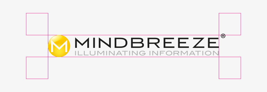
A clear protection zone must be maintained around the logo. This space ensures that the logo remains visible, legible, and visually independent from surrounding elements. No text, graphics, images, icons, borders, or other design elements may enter this area.
Logo Applications
Backgrounds
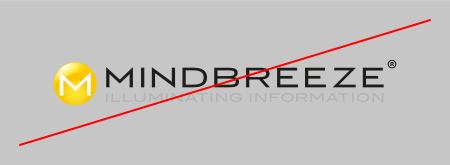
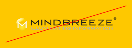
The Mindbreeze logo may be used on white, light gray, black, or suitable image backgrounds. Always select the logo version that provides the best contrast.
- Use dark logo versions on light backgrounds.
- Use light logo versions on dark backgrounds.
- Use the appropriate negative version on black or dark imagery.
When placing the logo on photography or visual backgrounds, ensure the logo sits on a calm, high-contrast area.
- Avoid busy or detailed backgrounds that reduce legibility.
Color Use
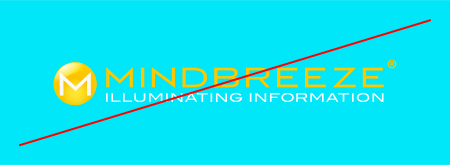
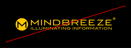
Only approved logo color versions may be used. The logo may not be recolored or adapted to match individual layouts, campaigns, or design preferences. Use the approved full-color, black, white, or negative logo versions depending on the background and application.
- Do not create new color combinations.
Use on Images
The logo may be placed on photography, renderings, or other imagery when there is sufficient contrast.
- Use the white or negative logo version on dark image areas.
- Use the black or full-color version on light image areas.
- Avoid placing the logo over detailed, busy, or low-contrast parts of an image.
If legibility cannot be ensured, choose a different placement or use a calmer background area.
Placement
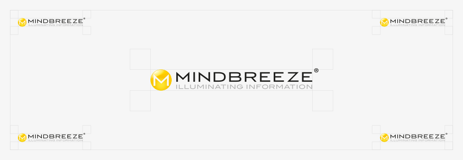
The logo should be placed clearly within the layout, preferably near the edge of the format. Depending on the medium, the logo may be placed in a corner, along a layout edge, or in a clearly defined brand area.
- It should not compete with headlines, key visuals, or important content.
The logo may only be centered when it is used as the main visual element, such as on a title slide, cover page, or brand-focused layout.
Do's & Dont's
Correct Use
- Use only approved logo files from the Brandbase.
- Use the primary logo whenever possible.
- Choose the correct logo version for the background.
- Maintain the defined proportions.
- Keep sufficient clear space around the logo.
- Ensure strong contrast and legibility.
- Use alternative logo versions only when the primary logo does not fit the application.


Incorrect Use
- Do not stretch, compress, rotate, crop, or distort the logo.
- Do not change the logo colors.
- Do not add shadows, outlines, gradients, glows, or other effects.
- Do not recreate the logo with another typeface or symbol.
- Do not separate or rearrange logo elements.
- Do not place the logo on busy or low-contrast backgrounds.
- Do not combine the logo with unapproved graphic elements.
- Do not use outdated, unofficial, or modified logo files.


Branding Examples
The following examples show how the Mindbreeze logo and visual identity are applied across branded touchpoints, promotional items, merchandise, and physical applications. They serve as visual orientation for creating a consistent and recognizable Mindbreeze brand presence.


